Gate 2 Task 10

Kory Schulz created these posters for the BFI Movie Festival which showcases class horror movies. I think these are really well done because of the cohesiveness between them all. I think he hit the nail on the head when it comes to contrast, except maybe with Frankensteins hair and the background. The characters really standout and that is party due to contrast. Repetition is used well when all of the posters are in the same environment, so you can see the theme and that they all go together. The alignment of these are also amazing, especially with Dracula hanging upside down in one of the posters. Once again, he posters work really well together. Proximity in this case is really important because if they were super far away from each other then they posters may not have been considered as good or impressive, because seeing them all together is what makes them so good.

Ariana Louise Villegas designed the next poster, which is more of a billboard. The Contrast worked really well with the red words and white background. But the repetition of this billboard is even better; with the repetition of all the white space to really push the purpose of the billboard, which is an ode to sexual harassment. The event that was being promoted was celebrating women who had broken through corporate glass ceilings. The alignment is different but very successful in this case. having the date all the way on the right with nothing else is the best way to convey when and where, and what you need to know. Having the woman on the left with the words, which is the main focus, is also another really good decision. The proximity is important in 2 ways. Having the two subjects far away from each other with a blank space in the middle is a good way to show the importance of both. also, having this billboard so close to the street guarantees that people will see it better and really not have a way to ignore it if they are just walking by.

Jen Bishop created the last design. This was a campaign that was aimed at NYC Subway riders. The riders were asked to vote for a celebrity subway announcer each day. The main point of this design was to spice up riders’ daily commutes by making the sign more interactive. Having the two neon colors contrast against the white, and each other, was a really good idea because it captures your attention, because those colors aren’t normally found in the subway. There really isn’t a use of repetition, besides the green, but in this case that is ok so it doesn’t take away from the main message, of “staying clear of the closing doors”. The alignment is great, with the words in the middle with the message, and Cardi B on the left just poking her head in, it adds humor. Proximity is used by having the words on top of Cardi so the message isn’t missed, and having this close to the ground so people can see it close up is also a smart move so it won’t be missed.

Gate 2 Task 9

Carolyn Davidson, born in 1943, is one of the most famous female American designers. She studied design at Portland State University in Portland, Oregon. She actually began as a journalism major but switched to design after taking a design course to fill an elective she needed. In 1971 she received her bachelor in graphic design. Her first design job was creating charts and graphs for one of her professors for his meetings with Japanese footwear executives. She was very successful and this lead to her designing posters, ads, and flyers for the same company. In 1971, her professor needed a logo for their new line of running shoes they were about to introduce. They then asked Davidson to come up with some ideas. She came up with five, one being a swoosh with hints of Nike the greek goddess of victory. She was payed $35 for this job, but this nike swoosh is one of the most recognizable brand logos in the world. A few years after the company went public, the owner gifted Davidson 500 shares, worth $1,000,000 now. Because of the grest success of this design, none of her other work ever received as much recognition. However, over the years as Nike has evolved, so has the logo. Davidson has been altering the Nike design as the company grows. I chose Davidson because when I was looking for designers, to my surprise, they were all men, and it was hard to find women amungst the group. Davidson was just so successful and her design could be recognized by so many all over the world. I thought it was important to focus on the success of a woman.
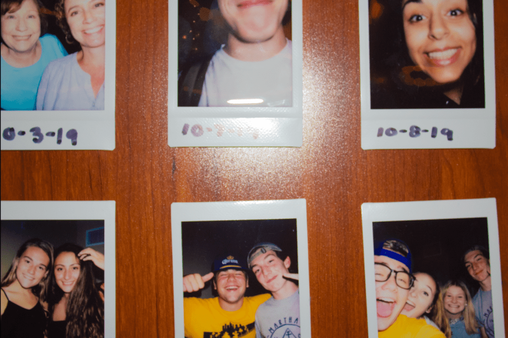
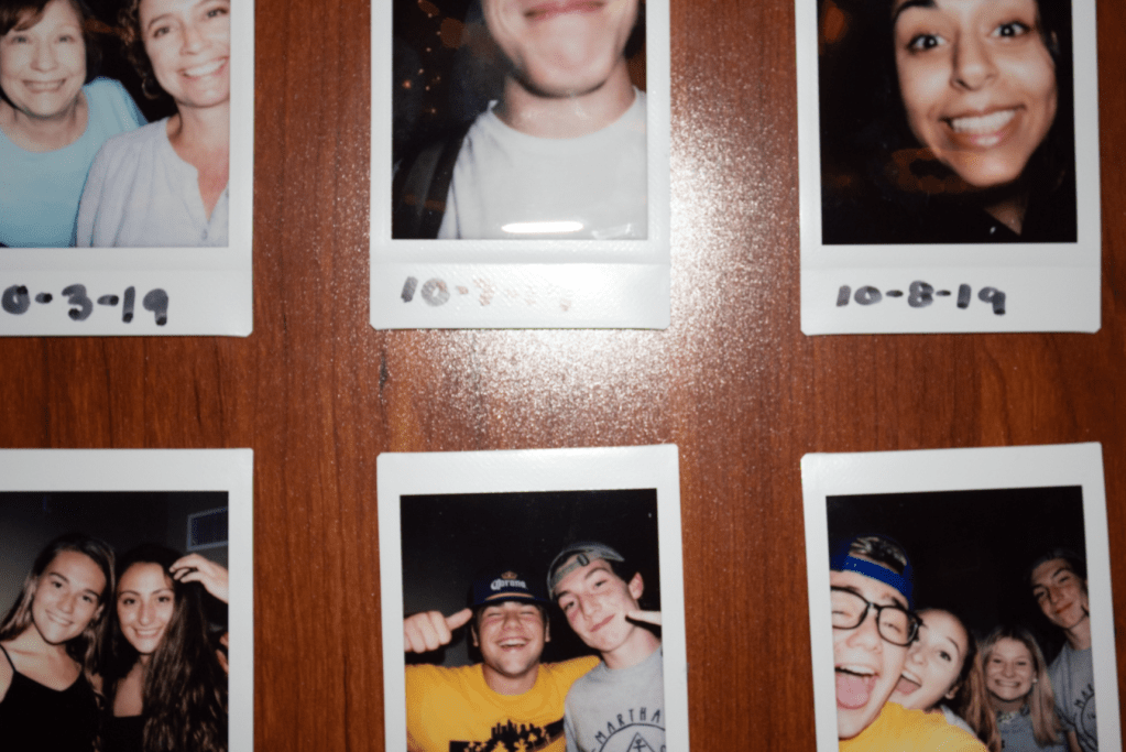
PROJECT 4-5 portraits

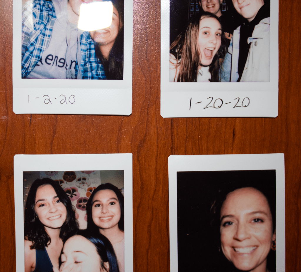
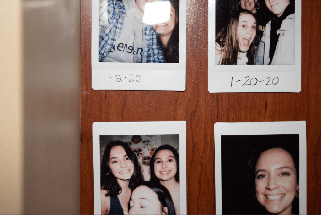
This project was not actually that challenging because I took them over such a long period of time. They were all taken over a month or so. The only part I found challenging was trying to mimic a portrait. If I did it again, I would have had the photos taken somewhere else because the lighting in my room is really bad.

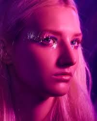
This is the image I was trying to mimic. It was taken by Krygina and the model is Hunter Schafer.
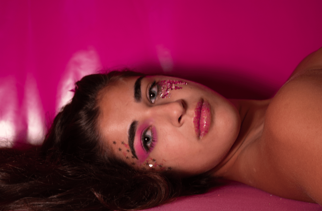
This is my version of the image. I know it is very different but the ones of her in the same pose turned out very bad. So I thought this image gave off the same vibes of the original, especially with the makeup. This was taken in my room with a lot of pink backdrops and glitter. The model is my best friend, Madison Lemone
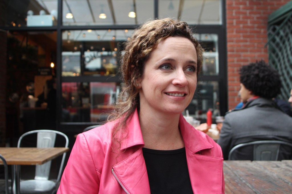
This is my mom in New York two weeks ago. We went for the weekend and stopped at this coffee place for a few minutes. I thought she looked really pretty so I took out my camera and captured it! There was a lot of light that day but it wasn’t very warm toned because it had been raining earlier.
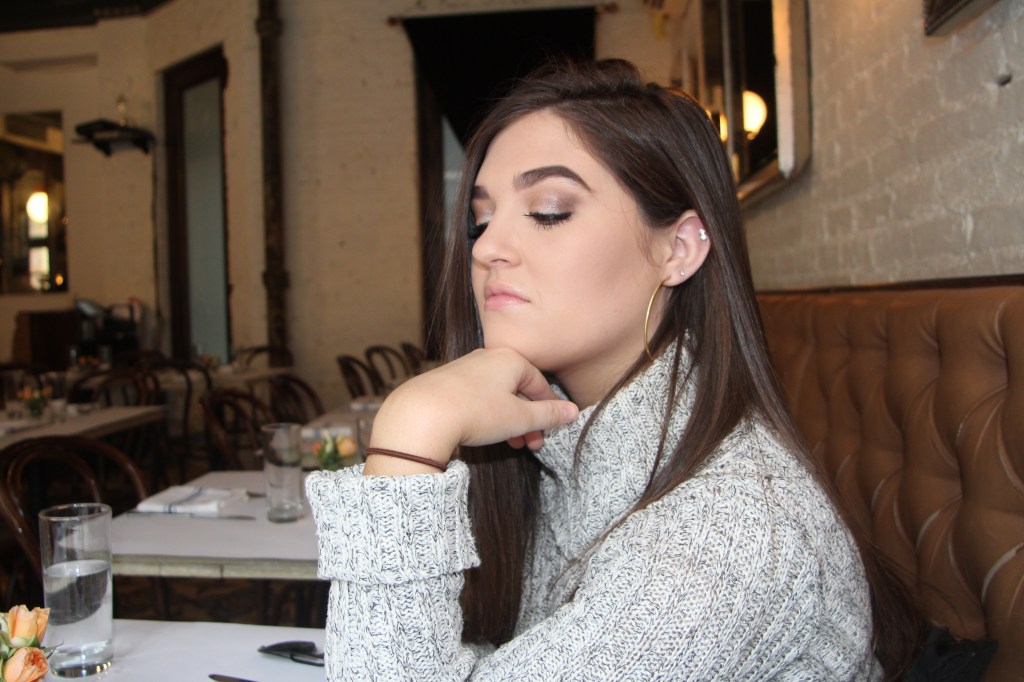
This was also taken in New York two weeks ago. This is my childhood friend Mackenzie. We were eating lunch and she was sitting like that and I thought she looked very dramatic so I decided to capture it. Luckily for all of these I just so happened to remember to bring my DSLR camera. We were sitting next to a window so there was a lot of natural light.
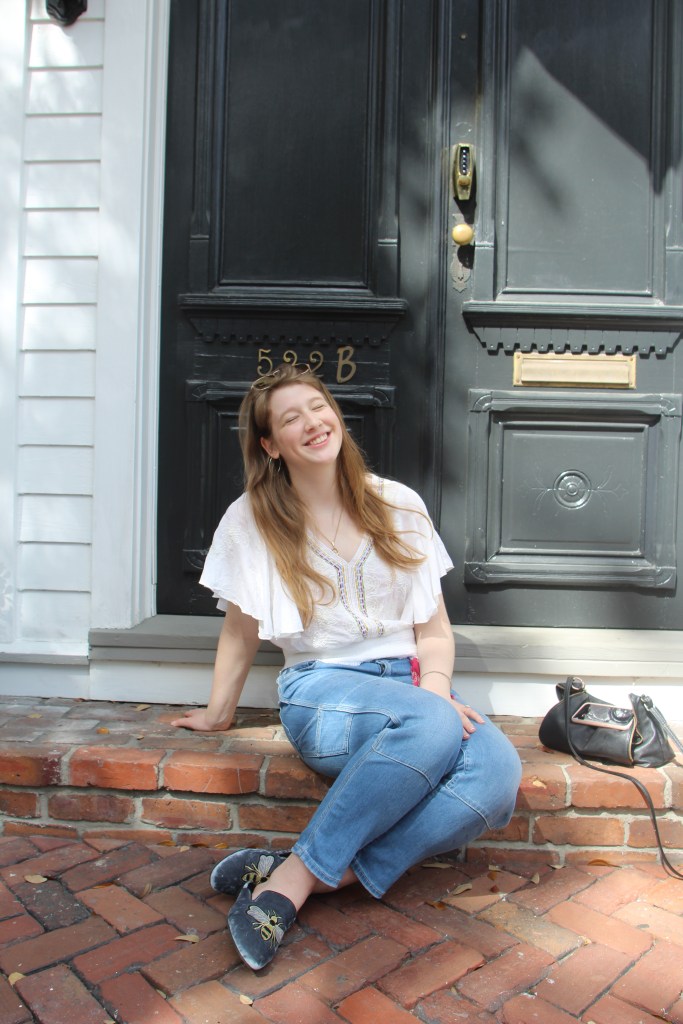
This is in Savannah, Georgia about a month ago. This is my friend Julia and we had just finished brunch downtown. We were taking pictures on our phone but she had her camera with her and let me use it to snap this picture really quickly. I love that this photo was taken on a whim but it really captures Julia’s essence- very care free and happy.
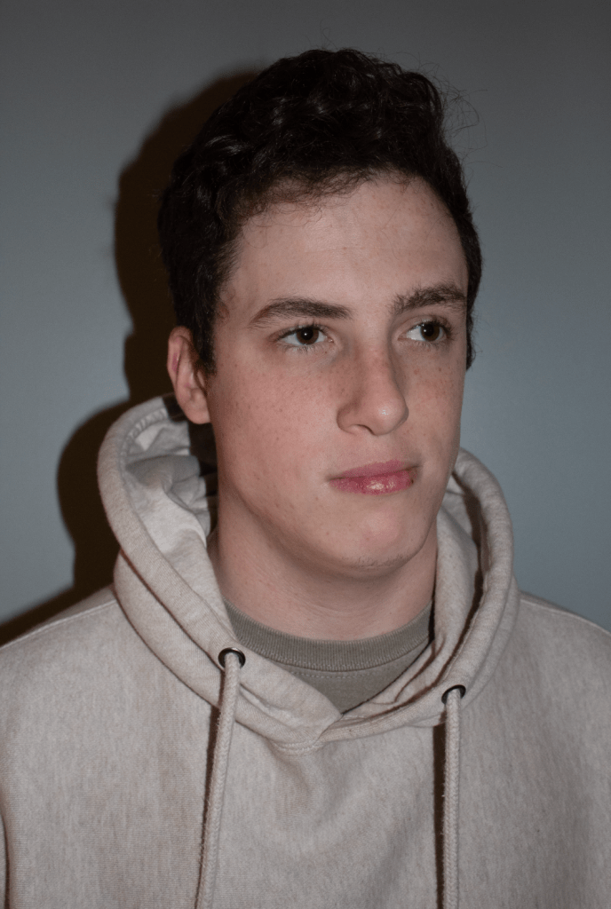
This is one of my friends on my hall, Caden, a few nights ago. He saw my camera and wanted his picture taken. This is just in our common room. This was actually hard to take because the lighting in the building we live in is so bad, I ended up having to turn off all the lights and just use my flash.

PROJECT 3- 5 objects

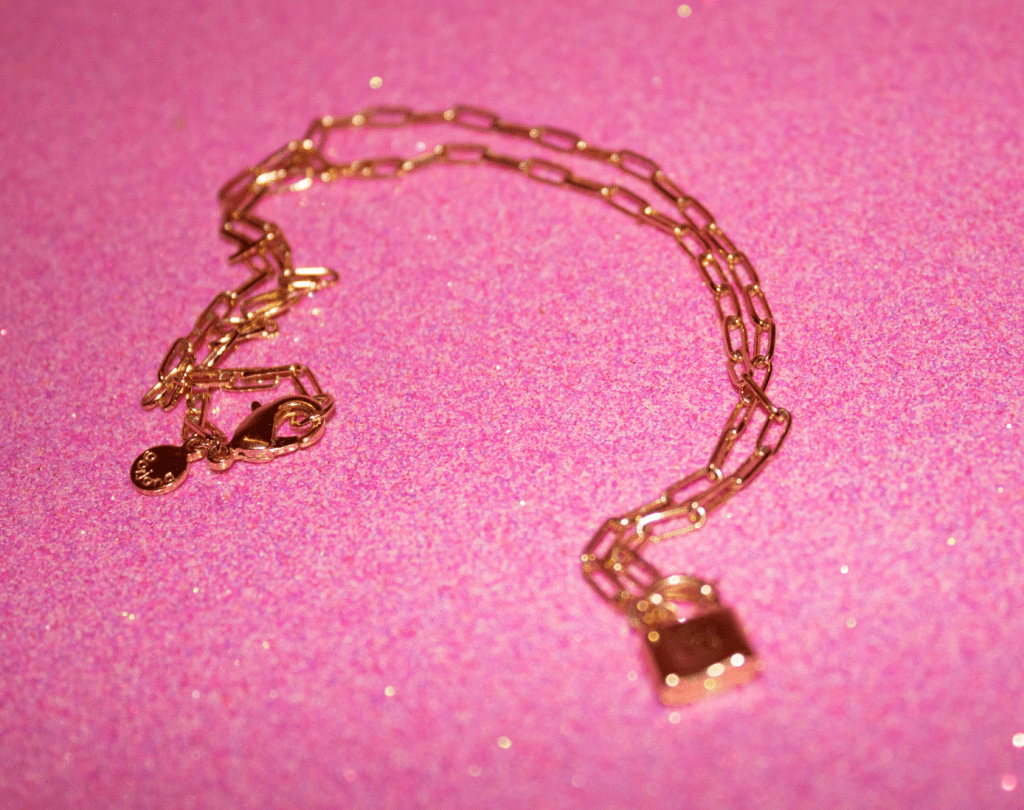
This necklace is important to me because of my mom. She gave this to me on my 10th birthday. Unfortunately the lock is out of focus but I still chose this one for a few reasons. The chain is what my mom gave me and a few years ago the pendent that was on it fell off. So I replaced it with this lock. So I left it focused on the chain instead of the lock because it is what is important to me, not the lock.
Unfortunately I do not have the most sentimental objects in my dorm room. But this ice cream has a story. So I hate chocolate and my best friend from home loves this Phish Food. She visited me the first week of school and bought this for me because she was so positive I would like it. I did not like it. But I don’t have the heart to throw it away because it reminds me of her. I thought it was a funny picture because it makes the ice cream look so glamorous, so I’m glad there is a very sparkly, shiny, part in the right corner.
I wear this ring every day and never take it off. Actually the first time I took it off was for this photo and Ive had it for over a year. It is a nail shape, and the shape has no significance, but once again my mom gave it to me. Basically anything my mom gives me I really treasure because she is my all time favorite person. I didn’t want the angle to be from above because then you wouldn’t be able to see that its a nail.
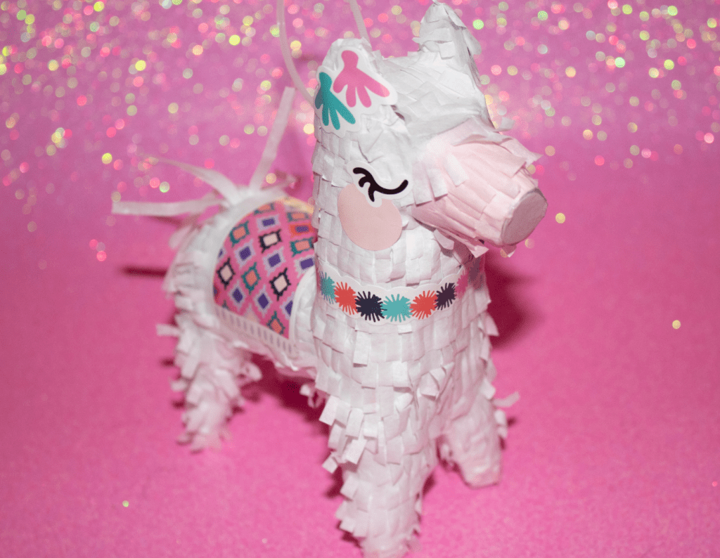
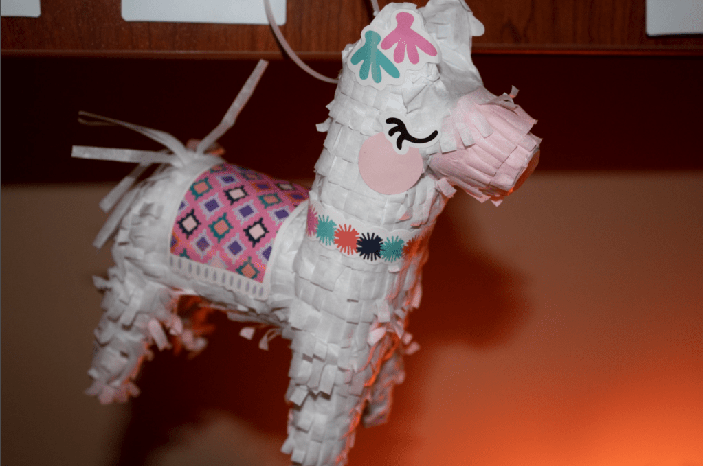
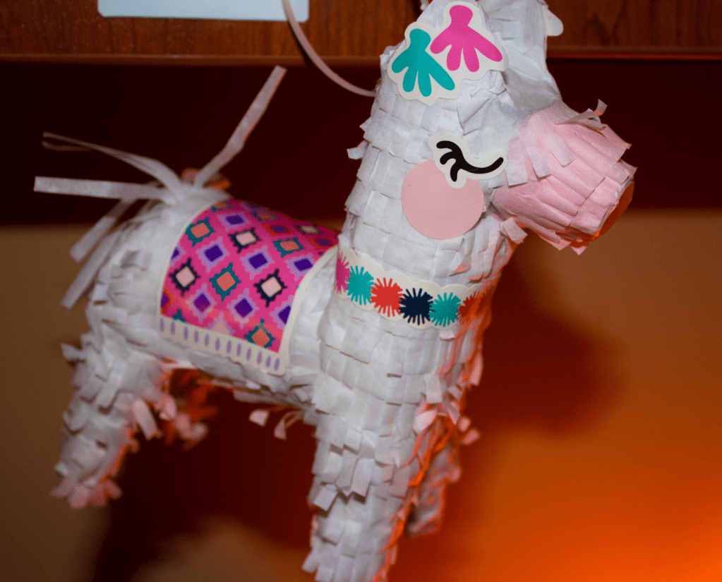
When I was a lot younger I used to be weirdly obsessed with llamas for no reason. I really loved them. Even though the phase has come and gone, I still appreciate a good llama when I see one. Last week was my 20th birthday and my mom came up to see me. She brought me this tiny llama because she knew I would appreciate it. I really think this is a very flattering picture of this llama.
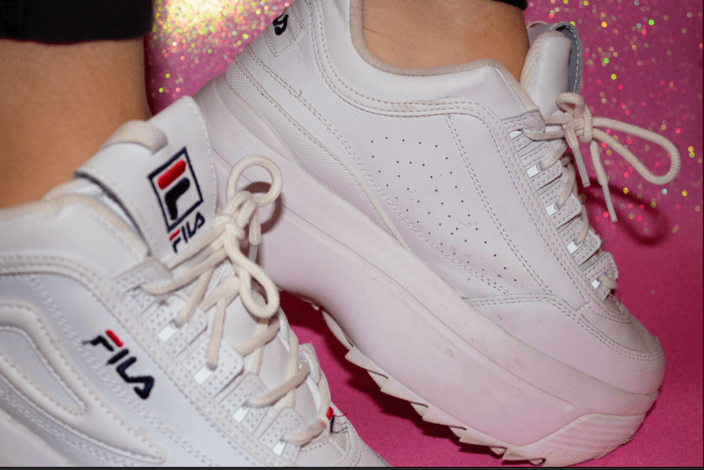
Last but not least are my favorite shoes. They are my favorites for a few reasons. The first is that they give me 4 inches of hight so I go from 5’4 to 5’8. They also were only $8 and everyone begged me not to buy them, because they are so ugly. I will admit they are truly hideous but I love them because they are fun and different. They looked weird without my feet in them so I posed a bit and the pictures turned out a lot better.

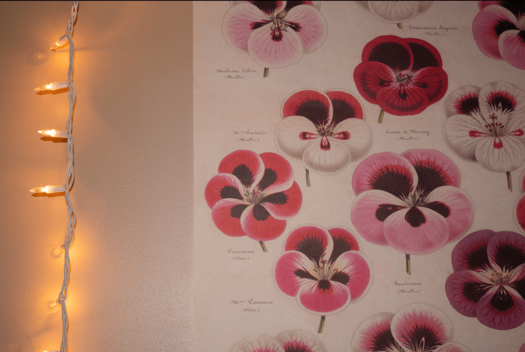
I decided to take all of the objects in front of the same background because I wanted them all to be cohesive, and represent me well. And I think a pink sparkly poster board with random objects does that well.

PROJECT 2-Color Correction and Cropping

Design a site like this with WordPress.com
Get started